One of the foundational rules of color theory is that opposite shades on the color wheel intensify one another. While this bold contrast works beautifully on a canvas, it can easily overwhelm a home interior. Because of this, design purists often warn that yellow and purple ‘should never be seen together’.
However, Pamela Shamshiri – the brilliant designer behind Anne Hathaway‘s home – completely ignored this rule for a stunning summer 2026 refresh, and the results are incredibly inspiring.
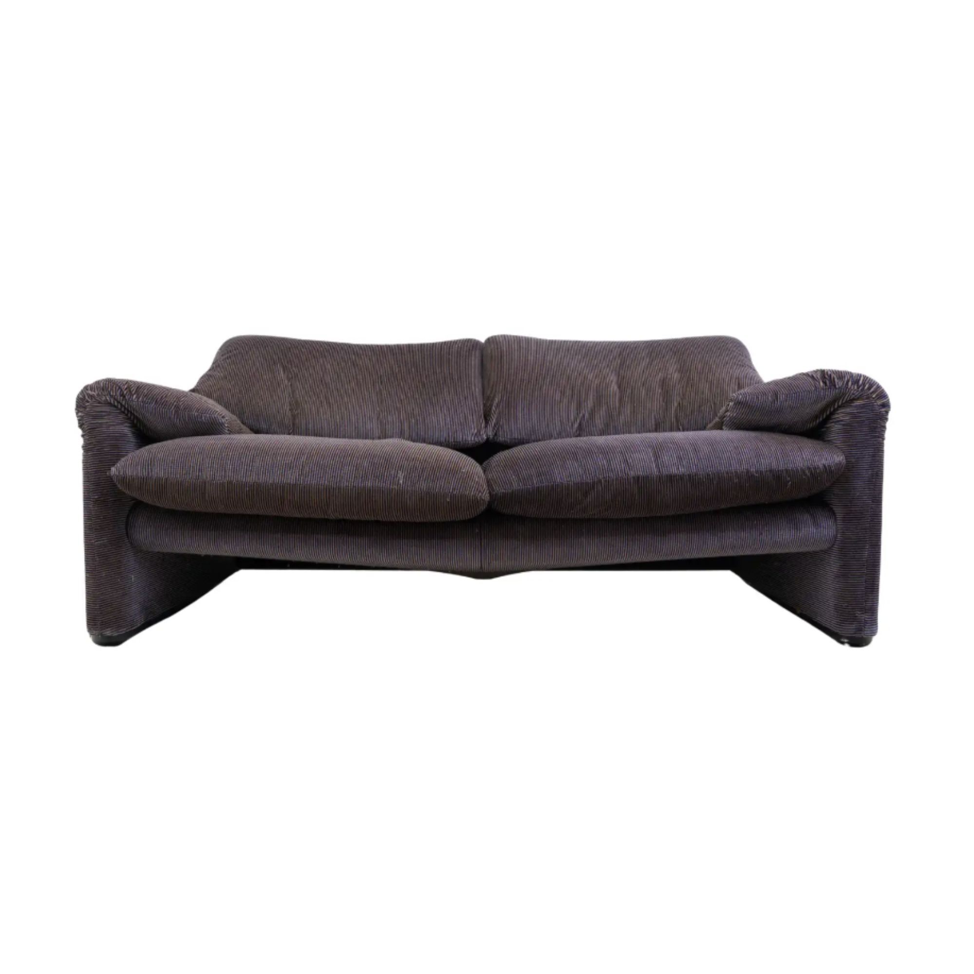
Hathaway’s living room features an unexpected setup: two purple sofas (similar to this one from 1stDibs) paired with a rich mustard yellow armchair, grounded by a cobalt blue chair resting between them. Rather than looking chaotic, this living room layout offers a fresh, sophisticated take on color blocking that feels perfect for the warm, sunlit seasons.

Shop Anne Hathaway’s Alpine-Style Living Room

Vico Magistretti – Maralunga Sofa
Anchoring the room with an iconic sculptural piece like this Vico Magistretti Maralunga Sofa for Cassina is the ultimate way to bring that same mid-century elegance and plush comfort into your own space

Upholstered L-Shaped Sectional
While Anne Hathaway’s sofa has more of a traditional silhouette, this L-shaped alternative, with its soothing clean lines, is a dream for more modern living rooms. Pair it with something yellow or blue (if you dare).

This piece is designed to change to your style. Keep the linen side on display for a more relaxed feel that works gracefully every day, or flip it over to uncover a velvet front when you’re in the mood for something a little more luxurious.

I adore this stool for its boutique hotel-style charm. The fringe adds just the right amount of movement, while the bun feet ground it with a considered touch. It’s the type of piece that makes a room feel more layered and lived-in, just like Anne’s.

There’s a certain beauty to the Theoden Terracotta Bowl that makes it so easy to style. Handmade from terracotta clay, its silhouette is simple, allowing the craftsmanship to take center stage. It’s an editor-favorite for a reason.

I keep looking at this Anne-inspired sconce and love how it manages to feel timeless but contemporary. Its elegant silhouette brings a sense of refinement, while the considered craftsmanship gives it a quality that feels built to last.
As a style editor who has analyzed thousands of celebrity properties over the years, I can confidently say that Shamshiri’s execution is the most masterful pairing of contrasting colors I have ever seen.
Several clever design choices explain why this controversial palette succeeds here when so many others fail.
First, Shamshiri opted for sophisticated shades rather than jarring neon yellow and royal purple. By selecting a muted, seasonal blend of rich mustard and lilac, the atmosphere remains refined rather than cartoonish. Second, the layout relies on strategic spacing to give the colors room to breathe. Decorating with purple via the living room sofas and angling the yellow armchair a few feet away prevents the shades from clashing directly. Finally, cohesive accents are woven quietly throughout the space to tie it all together. The walls feature subtle purple undertones that catch the bright summer light, while the yellow spines of coffee table books in the center of the room beautifully echo the armchair.
While we do not expect purple living room seating to completely dominate the design landscape in 2026, this space is a gorgeous reminder of why design rules are meant to be broken.
Sometimes, the most spectacular spaces come from taking a risk on the unexpected. Looking at Anne Hathaway’s home has completely transformed how I view this color duo – and there is simply no going back.
If you enjoy our celebrity news and interior design advice, why not sign up to our newsletter so you never miss the latest features?
‘ The preceding article may include information circulated by third parties ’
‘ Some details of this article were extracted from the following source www.homesandgardens.com ’